List 5 Formatting Guidelines You Should Follow When Developing a Cover Letter

TL;DR - Quick Answer
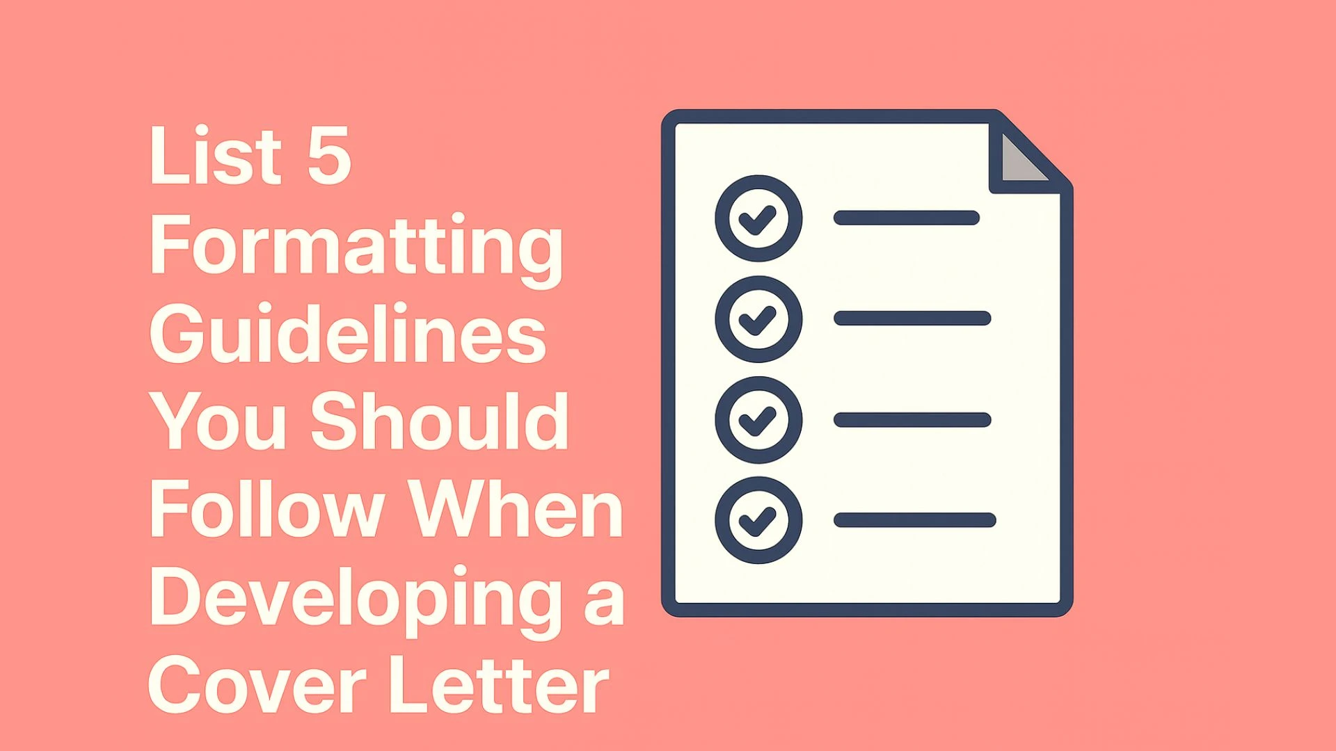
Five essential formatting guidelines transform good cover letters into professional, readable documents that hiring managers actually want to read. These are: 1) Use standard business letter format with proper header and spacing (1-inch margins, single spacing within paragraphs, double spacing between sections), 2) Choose professional fonts (Times New Roman, Arial, or Calibri at 10-12pt), 3) Keep length to one page maximum (250-400 words, 3-4 paragraphs), 4) Maintain consistent visual hierarchy with clear sections and proper alignment, and 5) Save and submit as PDF to preserve formatting across systems.
Research from TopResume shows that 68% of hiring managers notice formatting errors in the first 30 seconds of reviewing a cover letter. Proper formatting signals professionalism, attention to detail, and respect for the reader's time—qualities every employer seeks. Whether you're applying for corporate positions or creative roles, these five guidelines provide the foundation for a cover letter that gets read, not rejected.
5 Key Takeaways
Standard business letter format with 1-inch margins and consistent spacing creates professional appearance and ensures readability across all viewing platforms
Professional fonts (Times New Roman 10-12pt, Arial 10-11pt, Calibri 11-12pt) balance readability with space efficiency while avoiding attention-grabbing or dated typefaces
One-page maximum length (250-400 words) respects hiring managers' time constraints, with 89% preferring concise letters that fit on a single page
Clear visual hierarchy using section breaks, consistent alignment, and strategic emphasis guides readers to your most important qualifications quickly
PDF format submission preserves your formatting across different systems, with descriptive file naming (FirstName_LastName_CoverLetter_CompanyName.pdf) ensuring professionalism
Introduction: Why Formatting Matters More Than You Think
Imagine spending hours crafting the perfect cover letter—compelling stories, quantified achievements, genuine enthusiasm—only to have it dismissed in seconds because of poor formatting. Unfortunately, this scenario plays out daily in hiring offices worldwide. According to a 2026 study by Indeed, 76% of recruiters say they've rejected otherwise qualified candidates due to formatting issues in their application materials.
The harsh reality: hiring managers spend an average of just 34 seconds on an initial cover letter review. In that critical half-minute, formatting creates the first impression that either invites continued reading or triggers immediate rejection. Your cover letter's visual presentation communicates professionalism, attention to detail, and respect for the reader's time before a single word is read.
Poor formatting creates unnecessary barriers between your qualifications and the hiring decision-maker. When recruiters struggle to read your letter due to tiny fonts, inconsistent spacing, or unprofessional layouts, they simply move to the next applicant. In competitive job markets where positions receive 200+ applications, formatting excellence becomes a competitive advantage that ensures your content actually gets considered.
The good news? Proper formatting isn't complicated or time-consuming once you understand the five essential guidelines that professional resume writers and career coaches consistently recommend. These guidelines aren't arbitrary rules—they're battle-tested standards that account for how hiring managers actually review applications, how applicant tracking systems process documents, and how professional business correspondence has evolved in the digital age.
This comprehensive guide presents the five non-negotiable formatting guidelines that separate amateur cover letters from professional submissions. You'll discover the specific requirements for each guideline, understand the reasoning behind formatting decisions, learn industry-specific variations, and master the implementation details that ensure your cover letter looks impeccable on every screen and in every inbox.
Whether you're a recent graduate writing your first professional cover letter or an experienced professional refreshing your job search materials, these guidelines provide the formatting foundation that allows your qualifications and personality to shine through. Let's explore each guideline in detail, starting with the fundamental structure that underlies all professional business correspondence.
Guideline 1: Use Standard Business Letter Format
Standard business letter format provides the structural foundation for professional cover letters. This time-tested format has evolved over decades to optimize readability, convey professionalism, and facilitate quick information processing—exactly what busy hiring managers need.
The Complete Structure
A properly formatted cover letter follows this precise structure from top to bottom:
Header Information: Begin with your contact information at the top: full name, phone number, email address, and optionally your LinkedIn profile URL or professional website. Place this information either centered or left-aligned. Skip outdated elements like full mailing addresses unless specifically requested by the employer.
Date: Include the current date, spelled out in full (e.g., "January 15, 2026" rather than "1/15/25"). Position the date below your header information with appropriate spacing.
Recipient Information: Address your letter to a specific person whenever possible. Include their full name, title, company name, and company address. Research to find the hiring manager's name rather than using generic greetings. If you absolutely cannot identify a specific recipient, use a department name ("Marketing Department Hiring Team") rather than "To Whom It May Concern."
Salutation: Use "Dear [First Name Last Name]:" or "Dear Mr./Ms./Dr. [Last Name]:" followed by a colon (in U.S. format) or comma (in international formats). When the recipient's gender is unknown, use their full name: "Dear Taylor Johnson:"
Body Paragraphs: Organize your content into 3-4 focused paragraphs: opening (position and enthusiasm), qualifications (2-3 key achievements aligned with requirements), cultural fit and company research, and strong closing with call to action. Each paragraph should have a clear purpose and flow logically to the next.
Closing: End with a professional closing phrase such as "Sincerely," "Best regards," or "Thank you for your consideration," followed by a comma. Leave space for a signature (3-4 line breaks in printed letters, 2 line breaks in digital submissions), then type your full name. In digital submissions, you may include a scanned signature image between the closing and typed name, though this is optional.
Spacing and Margins
Proper spacing creates visual breathing room that makes your letter inviting rather than overwhelming:
Margins: Use 1-inch (2.54 cm) margins on all sides. This standard creates balanced white space and ensures your letter prints correctly without content being cut off. If you're struggling to fit content on one page, you can reduce margins to 0.75 inches minimum, but never go smaller.
Line Spacing: Use single spacing (1.0) within paragraphs to maximize space efficiency. This is standard for business correspondence and allows you to include more content without appearing cramped.
Paragraph Spacing: Leave one blank line (double space) between paragraphs, between your header and the date, between the date and recipient information, between recipient information and salutation, and before your closing. This white space guides the reader's eye and prevents visual fatigue.
Section Spacing: Leave 2-3 blank lines between your closing phrase and your typed name to create space for a signature in printed letters. In digital submissions, 1-2 blank lines suffice.
Important: Don't use paragraph indentation in modern business letters. Instead, use the block format where all text is left-aligned with spacing between paragraphs. This contemporary approach looks cleaner and more professional than indented formats popular in previous decades.
Common Mistakes to Avoid
Including full mailing addresses: Unless applying to very traditional industries (government, law, academia), skip your full street address. Phone, email, and LinkedIn are sufficient.
Using outdated salutations: Avoid "To Whom It May Concern" or "Dear Sir or Madam." Always research to find a specific name.
Mixing alignment styles: Choose either fully left-aligned or centered header, then maintain consistency throughout. Don't center some elements and left-align others randomly.
Insufficient white space: Cramming content by reducing spacing makes your letter harder to read and signals desperation to fit everything in.
Inconsistent spacing: Using random spacing between sections creates an unprofessional, haphazard appearance.
Industry-Specific Variations
While standard business format works for most industries, some fields have specific expectations:
Creative Industries (Advertising, Design, Marketing): You have more flexibility to incorporate subtle design elements like a colored header bar, custom typography, or strategic use of color. However, readability remains paramount—creative formatting should enhance rather than obscure your content.
Traditional Industries (Finance, Law, Government, Academia): Stick strictly to classical business letter format with full addresses, formal salutations, and conservative spacing. These industries value tradition and may view formatting innovations as unprofessional.
Tech and Startups: Modern block format works well. You can skip traditional elements like full addresses and use slightly more casual (but still professional) language and layout choices.
International Applications: Research formatting conventions for the target country. For example, British business letters traditionally use indented paragraphs rather than block format, while German applications often include extensive personal information.
Guideline 2: Choose Professional Fonts and Sizes
Font selection significantly impacts readability and professional perception. The right font conveys competence and attention to detail, while poor font choices can undermine even the strongest content.
Best Professional Fonts
Stick to fonts that are universally available, highly readable on screens and in print, and professionally accepted:
Times New Roman: The classic choice for business correspondence. Its serif design (small lines at the ends of letters) enhances readability in print. Best at 10-12 point size. Choose Times New Roman when applying to traditional industries or when you want to convey classical professionalism.
Arial: A clean, sans-serif font (without the small lines) that reads exceptionally well on screens. Best at 10-11 point size. Arial's slightly condensed spacing helps you fit more content per page compared to other fonts. Excellent choice for tech companies and modern industries.
Calibri: Microsoft's modern default font. Its rounded, approachable design balances professionalism with contemporary aesthetics. Best at 11-12 point size due to its slightly smaller x-height. Calibri works well across all industries and has become the de facto standard for business documents in the past decade.
Helvetica: A premium sans-serif font that's clean and professional. Best at 10-11 point size. Note that Helvetica isn't included with Windows (Arial is its replacement), so only use Helvetica if you're certain about the recipient's system or submitting as PDF.
Garamond: An elegant serif font that's more efficient than Times New Roman, allowing you to fit more content at the same point size. Best at 11-12 point size. Excellent for traditional industries where you need both professionalism and space efficiency.
Georgia: A serif font specifically designed for screen readability with larger letters than Times New Roman at the same point size. Best at 10-11 point size. Good choice for digital-first companies and when you know your letter will be primarily read on screens.
Font Size Guidelines
Font size must balance readability with space efficiency:
Body Text: Use 10-12 point depending on your font choice. Times New Roman, Garamond, and Georgia work at 10-12pt. Arial and Helvetica work best at 10-11pt. Calibri needs 11-12pt due to its smaller x-height. Never go below 10pt as it strains readability.
Your Name in Header: You can increase your name to 14-16 point to create visual hierarchy and make your identity immediately clear. However, avoid going larger than 16pt as it appears ostentatious.
Contact Information: Keep at the same size as body text (10-12pt) or slightly smaller (9-10pt) to maintain visual balance. Your contact information should be noticeable but not dominant.
Consistency Rule: Once you choose a font and size for body text, use it consistently throughout the entire letter. Don't change fonts or sizes mid-document except for your name in the header.
Fonts to Avoid
Certain fonts signal unprofessionalism and should never appear in cover letters:
Comic Sans: Universally considered unprofessional for business correspondence. Its casual, handwritten style is appropriate for children's materials but never for job applications.
Script or Handwriting Fonts: Fonts like Brush Script, Lucida Handwriting, or similar styles are difficult to read and appear overly decorative for business documents.
Decorative or Display Fonts: Fonts like Impact, Papyrus, or Curlz draw attention to themselves rather than your content. They're designed for headlines and graphics, not body text.
Monospace Fonts: Fonts like Courier New or Consolas (where each character takes the same width) are associated with typewriters and coding, not modern business correspondence.
Trendy or Unusual Fonts: Even professionally-designed fonts like Futura, Century Gothic, or Gotham can appear too distinctive or trendy for conservative industries. Save experimentation for creative portfolios.
The font choice principle: Your font should be invisible—readers should never consciously notice it. They should focus entirely on your qualifications and personality, not your typography choices.
Special Formatting Considerations
Bold and Italics: Use sparingly for emphasis. Bold can highlight company names or key achievements ("increased sales by 45%"). Italics work for publication names or to emphasize specific words. Never use underline—it's outdated and can confuse readers on digital platforms where underlines indicate hyperlinks.
Color: Stick to black text on white background for maximum professionalism and readability. In creative industries, you might use a colored header bar or accent color for your name, but body text must remain black. Avoid colored text entirely in traditional industries.
ALL CAPS: Never write in all capital letters except perhaps for your name in the header. All caps reduces readability by 10-15% and can appear as "shouting" in professional contexts.
Character and Line Spacing: Leave character spacing at default—don't expand or condense. Line spacing should be single (1.0) within paragraphs as discussed in Guideline 1. Manipulating these spacings to fit more content typically makes letters harder to read without appearing obviously altered.
The Readability Test
After formatting your cover letter, perform this simple test:
Print your letter or view it at 100% on screen
Hold it at arm's length or step back from your monitor
Can you still read it comfortably? Are paragraphs clearly defined?
Does it look balanced with appropriate white space?
If your letter fails this test—text appears too small, cramped, or difficult to distinguish—increase font size or adjust spacing. Hiring managers often review applications in challenging conditions (mobile devices, quick scans between meetings), so exceptional readability is essential.
Guideline 3: Keep It to One Page Maximum
Length discipline separates effective cover letters from rambling ones. The one-page maximum isn't an arbitrary restriction—it's based on hiring manager attention spans and processing realities.
Why One Page?
Research from TheLadders' eye-tracking studies reveals that recruiters spend an average of 7.4 seconds on a cover letter during initial screening. A concise one-page letter respects this reality by presenting only the most compelling information. Additionally:
89% of hiring managers prefer one-page cover letters (Career Builder survey)
Multi-page letters signal inability to prioritize and communicate concisely
Longer letters have lower completion rates—readers simply don't finish them
One page displays completely on a single screen without scrolling, critical for digital review
The underlying principle: Your cover letter supplements your resume, not duplicates it. It should highlight 2-3 key qualifications and demonstrate cultural fit, not provide comprehensive career history.
Optimal Word Count
Target 250-400 words total. This range allows you to:
Opening paragraph (50-75 words): State the position, express enthusiasm, mention how you learned about the opportunity
Qualifications paragraph 1 (100-125 words): Highlight your most relevant achievement with specific metrics
Qualifications paragraph 2 (100-125 words): Present another strong qualification or demonstrate cultural fit with company research
Closing paragraph (50-75 words): Reiterate interest, reference attached resume, include call to action
Letters under 200 words appear perfunctory and fail to make a compelling case. Letters over 500 words risk losing reader attention and suggest you cannot communicate concisely—a crucial professional skill.
How to Fit Content on One Page
If you're struggling to fit content on one page, use these strategies before resorting to formatting manipulation:
Content Editing (First Priority):
Remove redundant phrases ("I am writing to express my interest" → "I'm excited to apply for")
Delete obvious statements ("As you can see from my resume..." adds no value)
Eliminate repetition between paragraphs
Cut weak examples—quality over quantity
Remove generic statements that don't specifically address this job
Smart Formatting Adjustments (Second Priority):
Reduce margins from 1 inch to 0.75 inches (but no smaller)
Choose space-efficient fonts like Arial (10-11pt) or Garamond (11-12pt)
Reduce spacing between sections from double to 1.5 line spacing
Shorten your header by removing full address if included
Combine related sentences to eliminate paragraph breaks
Never:
Reduce font below 10 point
Reduce margins below 0.5 inches
Manipulate character spacing or line height
Extend to a second page with just 2-3 lines
Paragraph Length Guidelines
Beyond overall length, paragraph structure affects readability:
Aim for 3-4 paragraphs total (opening, 1-2 body paragraphs, closing)
Each paragraph should be 4-7 sentences maximum
Avoid single-sentence paragraphs (appear choppy) and 10+ sentence paragraphs (appear dense)
Vary sentence length within paragraphs to maintain reader engagement
Paragraph length directly impacts visual appeal. When printed or viewed on screen, each paragraph should appear as a manageable block of text with clear separation from surrounding paragraphs.
When Two Pages Might Be Acceptable
In rare circumstances, exceeding one page is acceptable:
Academic positions: Applying for faculty positions, research roles, or post-doctoral positions may require detailed discussion of publications, research methodology, and teaching philosophy. In academia, 1.5-2 page cover letters are more common.
Executive-level positions: C-suite or senior leadership roles with 20+ years of experience may justify additional length to address complex qualifications and leadership philosophy. However, even here, conciseness is valued.
Specific employer request: If the job posting explicitly requests detailed responses to specific questions or prompts, you may exceed one page to provide thorough answers.
International applications: Some countries (particularly in Europe) expect more comprehensive application letters that may extend to two pages.
If you do write a two-page letter, ensure it's genuinely two full pages. Never submit a letter that's 1.1 pages with just a sentence or two on page two—either edit to fit on one page or expand to justify two full pages.
The White Space Principle
One page doesn't mean densely packed text with minimal margins. Proper formatting includes generous white space that makes your letter inviting to read. A well-formatted one-page letter with balanced white space is infinitely more effective than a cramped letter with tiny fonts and narrow margins that technically fits on one page but strains readability.
When viewed on screen or in print, approximately 50% of your page should be text and 50% should be white space (margins, spacing between paragraphs, spacing around header elements). This balance creates a professional, polished appearance that invites reading rather than overwhelming the viewer.
Guideline 4: Maintain Consistent Visual Hierarchy
Visual hierarchy guides readers' eyes to important information and creates a professional, organized appearance. Even with perfect margins, fonts, and length, a cover letter can fail if it lacks clear visual structure.
Creating Visual Hierarchy
Visual hierarchy in cover letters relies on strategic use of:
1. Size Variation:
Your name (largest element): 14-16pt if in header
Section headers if used (not typical in cover letters): 12-14pt
Body text (most text): 10-12pt
Contact information: 9-11pt (can be smaller than body)
This creates a natural top-down importance: your identity is immediately clear, then readers move into your content.
2. Spacing and Separation:
More space around major sections (header, date, recipient info, opening, body, closing)
Less space between related items (lines within contact info, sentences within paragraphs)
Consistent spacing between paragraph breaks
Spacing communicates relationships: elements close together are related, while spacing separates distinct sections.
3. Alignment Consistency:
Choose left-aligned (most common and readable) or centered header
All body paragraphs should be left-aligned
Closing can be left-aligned or centered to match header
Never use justified alignment (where text aligns to both left and right margins) as it creates awkward spacing
Consistent alignment creates order and professionalism. Random alignment changes create chaos.
4. Visual Weight:
Your name may be bold in the header for emphasis
Company names or job titles may be bold for recognition
Key metrics or achievements may be bold for impact
Use bold sparingly—if everything is bold, nothing stands out
Emphasis Strategies
When you want to emphasize specific information:
Strategic Bold: Use for 2-3 key items maximum. Good candidates for bold include specific metrics ("increased revenue by 45%"), particularly relevant skills ("project management certification"), or the company name you're addressing.
Example: "In my role at TechCorp, I led a team of 12 developers to deliver a platform redesign that increased user engagement by 67% and reduced churn by 23%."
Italics for Subtle Emphasis: Use for publication names, titles of works, or very occasional emphasis of specific words. Italics are subtler than bold and should be used even more sparingly.
Position for Emphasis: The most important information should appear at the beginning of sentences and paragraphs. Readers naturally focus more on openings, so structure sentences to place key information first.
Weak: "Revenue increased by 45% after I implemented a new sales strategy."
Strong: "I implemented a new sales strategy that increased revenue by 45%."
The Five-Second Scan Test
Give your formatted cover letter to someone unfamiliar with your background. Ask them to look at it for just five seconds, then take it away. Can they tell you:
Your name?
Who you're addressing it to?
The general structure (opening, body, closing)?
1-2 emphasized items if any?
If they can't identify these elements in five seconds, your visual hierarchy needs improvement. Hiring managers often spend even less time on initial scans, so immediate visual clarity is essential.
Common Visual Hierarchy Mistakes
Inconsistent spacing: Using different spacing between paragraphs creates a haphazard appearance. Space should be uniform throughout.
Random bold: Bolding many different elements without clear purpose dilutes impact. Be strategic and consistent.
Mixing fonts: Using different fonts for different sections creates disorganization. Stick to one font throughout, with possible exception of your name in header.
Overcrowding: Trying to cram too much information without adequate white space overwhelms readers.
Weak header: Making your name too small or burying your contact information makes it hard for employers to reach you.
No clear sections: Running all content together without clear breaks between header, date, recipient information, body, and closing creates confusion.
Accessibility Considerations
Good visual hierarchy also improves accessibility for readers with visual impairments:
High contrast between text and background (black on white is optimal)
Sufficient font size (never below 10pt)
Clear section breaks that screen readers can identify
Proper document structure if submitting editable formats
While hiring managers may not have visual impairments, accessibility best practices improve readability for all readers, especially when viewing on mobile devices or in challenging lighting conditions.
Guideline 5: Save and Submit as PDF Format
You've formatted your cover letter perfectly—standard structure, professional fonts, one page length, clear visual hierarchy. Now the final critical step: saving and submitting in the right format. Choose the wrong format, and all your careful formatting can be destroyed when the hiring manager opens your file.
Why PDF is Essential
PDF (Portable Document Format) preserves your formatting exactly as you created it, regardless of the recipient's device, operating system, or software. Here's why PDF is the professional standard:
Formatting Preservation: PDFs display identically on Windows, Mac, Linux, iOS, Android, and web viewers. Your carefully chosen fonts, margins, spacing, and alignment remain exactly as you designed them. Word documents (.doc, .docx), by contrast, can reflow completely differently depending on the recipient's Word version, installed fonts, and default settings.
Professional Standard: PDF is the universally accepted format for business documents. Submitting a PDF signals you understand professional norms. A 2026 Jobvite survey found that 84% of recruiters prefer PDF submissions for application materials.
Security and Finality: PDFs are read-only by default, preventing accidental (or intentional) editing. This protects your content and demonstrates that this is your final, polished submission rather than a draft document.
File Size Efficiency: PDFs are typically smaller than equivalent Word documents, making them easier to email and less likely to trigger size restrictions in applicant tracking systems.
Universal Accessibility: Every modern device has PDF viewing capability built-in (web browsers, operating systems, mobile apps). Recipients never need special software to open your file.
ATS Compatibility: Modern applicant tracking systems parse PDFs effectively. While ATS compatibility concerns were valid a decade ago, current systems handle text-based PDFs without issues.
How to Create Quality PDFs
Creating a PDF is simple, but quality matters:
From Microsoft Word:
Go to File > Save As
Choose "PDF" from the file type dropdown
Click "Options" and ensure "ISO 19005-1 compliant (PDF/A)" is NOT checked (this creates larger files)
Ensure "Document properties" and "Document structure tags for accessibility" ARE checked
Click OK, then Save
From Google Docs:
Go to File > Download > PDF Document (.pdf)
Google Docs automatically creates high-quality PDFs with preserved formatting
From Mac Pages:
Go to File > Export To > PDF
Set Image Quality to "Best"
Click Next, then Export
Print-to-PDF Method (Any Application):
Go to File > Print
Select "Save as PDF" or "Microsoft Print to PDF" as your printer
Adjust settings to ensure high quality
Click Print/Save
Important: After creating your PDF, always open it to verify formatting is preserved exactly as intended. Check fonts, spacing, margins, and overall appearance before submitting.
File Naming Best Practices
Your file name is part of your professional presentation:
Professional Format: FirstName_LastName_CoverLetter_CompanyName.pdf
Example: Sarah_Johnson_CoverLetter_Acme.pdf
File Naming Rules:
Use underscores (_) or hyphens (-), never spaces
Include your full name so files are identifiable when downloaded
Include "CoverLetter" to distinguish from resume and other documents
Include company name for easy identification in your sent folder
Keep it concise—under 50 characters total
Use consistent capitalization (title case or sentence case throughout)
Poor File Names to Avoid:
"cover letter.pdf" - Not identifiable, uses spaces
"CL.pdf" - Too vague and cryptic
"Sarah Johnson resume and cover letter final v3.pdf" - Too long, confusing
"COVER_LETTER_SARAH_JOHNSON.pdf" - All caps appears aggressive
When to Use Word Format Instead
In rare cases, Word format (.docx) may be appropriate or required:
Explicit Request: If the job posting specifically requests Word format or .docx files, follow instructions exactly. Some companies have workflows that require editable formats.
ATS Requirement: Some older applicant tracking systems may specify Word format. When in doubt, follow system instructions.
Collaboration Needed: If a recruiter or career counselor is helping you and needs to provide feedback, share a Word version for collaboration, then create PDF for final submission.
When submitting Word format:
Use .docx (modern format) rather than .doc (legacy format)
Embed all fonts if possible (in Word: File > Options > Save > Embed fonts)
Use standard fonts (Times New Roman, Arial, Calibri) that every system has
Test your file by opening on another computer if possible
Default Rule: When the job posting doesn't specify a format, always use PDF. It's the safer, more professional choice that ensures your formatting is preserved.
Quality Control Before Submission
Before attaching your PDF to any application:
Open in PDF Reader: View your PDF in Adobe Reader, browser PDF viewer, or Preview (Mac) to confirm formatting is preserved.
Check Every Section: Verify header, date, recipient info, body paragraphs, and closing all appear correctly formatted.
Verify One Page: Confirm your PDF is exactly one page. Check the page count displayed in your PDF viewer.
Test Text Selection: Try selecting and copying text from your PDF. If you can't select text, you've created an image-based PDF (from scanning) rather than a text-based PDF, which will have ATS compatibility issues.
Check File Size: Your cover letter PDF should be under 200KB. Files over 1MB suggest you've embedded unnecessary images or used poor compression. Large files may be rejected by email or ATS size limits.
Verify File Name: Double-check your file follows professional naming conventions before attaching.
View on Mobile: If possible, email your PDF to yourself and open on a mobile device. Many recruiters review applications on phones, so ensure your letter is readable on small screens.
Common PDF Mistakes
Scanned PDFs: Printing your cover letter and scanning it creates an image PDF that isn't ATS-compatible and appears unprofessional. Always create PDFs digitally from your word processor.
Password Protection: Never password-protect your cover letter PDF. Hiring managers won't have the password and will simply skip your application.
Multiple Documents: Don't combine cover letter and resume into one PDF unless explicitly requested. Keep them as separate files for easier processing.
Poor Compression: Over-compressed PDFs can make text appear fuzzy or pixelated. Use standard compression settings from your word processor.
No Quality Check: Submitting without opening your PDF to verify formatting is preserved is a critical mistake that leads to unexpected formatting disasters.
Comprehensive Implementation: Putting All 5 Guidelines Together
Understanding each guideline individually is valuable, but mastery comes from implementing all five together cohesively. Here's your complete formatting checklist and workflow for creating perfectly formatted cover letters every time.
The Complete Formatting Checklist
Before submitting any cover letter, verify every item:
Document Setup:
☐ 1-inch margins on all sides (0.75 inch minimum if needed)
☐ Professional font: Times New Roman, Arial, or Calibri
☐ Font size 10-12pt for body text
☐ Single spacing (1.0) within paragraphs
☐ Double spacing (one blank line) between paragraphs
☐ Left-aligned text (block format, no indentation)
Content Structure:
☐ Header with name and contact information
☐ Current date
☐ Recipient information (name, title, company)
☐ Professional salutation with recipient's name
☐ 3-4 body paragraphs (opening, qualifications, cultural fit, closing)
☐ Professional closing ("Sincerely," "Best regards,")
☐ Your typed name after closing
Length and Content:
☐ Exactly one page (no spilling to page 2)
☐ 250-400 words total
☐ Each paragraph is 4-7 sentences
☐ Adequate white space (not cramped or dense)
☐ No orphaned lines (1-2 lines on page 2)
Visual Elements:
☐ Consistent alignment throughout
☐ Clear visual hierarchy (name prominent, sections distinct)
☐ Bold used sparingly (2-3 items maximum)
☐ No underlining (except in hyperlinks if applicable)
☐ Black text on white background
☐ No decorative elements (borders, graphics, images)
File and Submission:
☐ Saved as PDF format
☐ File name follows format: FirstName_LastName_CoverLetter_Company.pdf
☐ PDF opens correctly and displays formatting as intended
☐ Text is selectable (not scanned image)
☐ File size under 200KB
☐ Tested viewing on mobile device
Workflow for Creating Formatted Cover Letters
Follow this systematic process for consistent formatting success:
Step 1: Setup Your Template (One-Time Setup)
Create a new document in your word processor
Set margins to 1 inch on all sides
Choose your font (Arial 11pt, Times New Roman 12pt, or Calibri 11pt recommended)
Set line spacing to single (1.0)
Set alignment to left
Type your header (name and contact information)
Leave space for date, recipient information, salutation
Add placeholder text for body paragraphs
Add closing with your name
Save as "CoverLetter_Template.docx" for future use
Step 2: Customize for Each Application
Open your template and Save As with new name
Update date to current date
Research and add recipient's name, title, and company
Write your customized content
Keep checking word count to stay within 250-400 words
Step 3: Format and Refine
Read through and ensure proper spacing between sections
Add strategic bold to 1-2 key achievements if desired
Verify letter fits on exactly one page
Check that white space appears balanced
Run spell check and grammar check
Step 4: Create PDF
Save your Word document first
Export or Save As PDF
Name file: FirstName_LastName_CoverLetter_CompanyName.pdf
Open PDF to verify formatting
Step 5: Quality Control
Open PDF in reader
Verify every section appears correctly
Check file is exactly 1 page
Confirm text is selectable
Run through complete checklist above
Get second opinion if possible
Step 6: Submit
Attach PDF to application or email
Double-check you've attached the correct file
Verify file name is professional
Submit application
Industry-Specific Formatting Considerations
While the five core guidelines apply universally, certain industries have additional expectations or allowances for formatting variations.
Traditional/Conservative Industries
Finance, Banking, Law, Government, Academia, Insurance, Accounting
Additional Requirements:
Use full recipient address including street address
Include your full mailing address in header
Stick to Times New Roman or Garamond for classical appearance
Avoid any bold or visual emphasis
Use extremely formal language and tone
No creative elements whatsoever
These industries value tradition, formality, and adherence to established conventions. Innovation in formatting can be perceived negatively as lacking respect for professional norms.
Creative Industries
Advertising, Marketing, Graphic Design, Fashion, Media, Entertainment, Public Relations
Additional Allowances:
Subtle color accents (colored header bar, colored text for your name)
Modern font choices (Helvetica, Futura, custom brand fonts)
Strategic use of design elements (minimal lines, spacing variations)
Slightly more visual hierarchy and emphasis
Personal branding elements that match your portfolio
Key Principle: Creative formatting should demonstrate design skill and brand consistency, not distract from content. Readability remains paramount. Your cover letter isn't a design showcase—it's a professional business document that can include tasteful creative elements.
Tech and Startups
Software Development, IT, Tech Startups, Digital Marketing, E-commerce
Appropriate Approaches:
Modern sans-serif fonts (Arial, Calibri, Helvetica)
Skip traditional addresses—email and LinkedIn sufficient
Clean, minimalist design
Strategic use of bold for metrics and achievements
Link to GitHub, portfolio, or personal website in header
Tech companies value clarity, efficiency, and modern design sensibilities. Your formatting should feel contemporary and streamlined rather than classical or decorative.
Healthcare
Medical, Nursing, Healthcare Administration, Pharmaceutical, Clinical Research
Specific Expectations:
Professional but not overly formal
Clear, highly readable fonts (Arial or Calibri preferred)
Standard business format
No creative elements or colors
Focus on clarity and professionalism
Healthcare combines professional rigor with practical efficiency. Formatting should reflect competence and attention to detail without unnecessary embellishment.
Education
Teaching, School Administration, Higher Education, Curriculum Development
Formatting Guidelines:
Traditional business letter format
Classical fonts (Times New Roman, Garamond, Georgia)
May extend to 1.5 pages for senior positions
Include full recipient address
Formal, respectful tone reflected in formatting choices
Educational institutions tend toward traditional formatting while accepting slightly longer length for experienced educators who need to address teaching philosophy and educational impact.
The 10 Most Common Formatting Mistakes (And How to Fix Them)
Even candidates who understand formatting guidelines often make these critical errors:
Mistake 1: Using Generic Salutations
Problem: "To Whom It May Concern" or "Dear Hiring Manager" signals lack of research effort.
Fix: Research to find the hiring manager's name via LinkedIn, company website, or calling reception. Use "Dear [First Name Last Name]:" When truly impossible to identify a name, use department-specific address: "Dear Marketing Team Hiring Committee:"
Mistake 2: Cramming Content with Tiny Fonts
Problem: Using 9pt fonts or smaller and 0.5-inch margins to fit excessive content on one page creates readability nightmare.
Fix: Edit content ruthlessly to fit proper formatting. If you have too much to say at 10pt font with 1-inch margins, your problem is content bloat, not formatting constraints. Remove redundancy and weak examples rather than manipulating formatting.
Mistake 3: Spilling Slightly Onto Page Two
Problem: Cover letter is 1.1 pages with just closing and signature on page two.
Fix: Edit to fit on one page by reducing a few words per paragraph, slightly adjusting spacing, or choosing a more space-efficient font. Never submit a letter with 2-3 lines on page two—it appears unprofessional and suggests you don't review your work.
Mistake 4: Inconsistent Spacing
Problem: Random spacing between sections—sometimes one blank line, sometimes two, sometimes three—creates chaotic appearance.
Fix: Establish consistent spacing: one blank line between paragraphs, one blank line between major sections, 2-3 blank lines before closing signature. Apply uniformly throughout document.
Mistake 5: Submitting Word Documents When Not Required
Problem: Sending .docx files that may display differently on recipient's system, losing formatting you carefully created.
Fix: Always submit PDF unless job posting explicitly requires Word format. PDF preserves formatting exactly as you created it.
Mistake 6: Poor File Naming
Problem: Generic file names like "cover letter.pdf" or "CL.pdf" that aren't identifiable when hiring manager downloads dozens of applications.
Fix: Use professional naming: FirstName_LastName_CoverLetter_CompanyName.pdf. This makes your file easily identifiable and demonstrates attention to detail.
Mistake 7: Excessive Bolding and Emphasis
Problem: Bolding multiple items per paragraph, using underline, all caps, and colors simultaneously creates visual chaos.
Fix: Use bold for 2-3 key items maximum across entire letter. Avoid underline and all caps entirely. Let strong content speak for itself rather than relying on excessive formatting tricks.
Mistake 8: Including Full Mailing Addresses Unnecessarily
Problem: Including complete street addresses for both sender and recipient wastes space and looks outdated unless required by industry.
Fix: For modern industries, include only: name, phone, email, LinkedIn in your header. For recipient, include name, title, and company name (skip street address). Reserve full addresses for traditional industries.
Mistake 9: Not Testing PDF Before Submission
Problem: Creating PDF and submitting without opening to verify formatting is preserved. Sometimes PDF conversion introduces unexpected formatting changes.
Fix: Always open your PDF before submitting. Verify fonts, spacing, margins, and overall appearance match your original document. Check on mobile device if possible.
Mistake 10: Identical Formatting Across All Industries
Problem: Using identical formatting for conservative law firm and creative advertising agency applications.
Fix: While maintaining core guidelines, adjust formatting appropriately for industry. Traditional industries need classical formatting; creative industries allow subtle design elements. Research industry norms and adjust accordingly.
Frequently Asked Questions About Cover Letter Formatting
Q1: Can I use color in my cover letter?
For most industries, stick to black text on white background. Creative industries (advertising, design, marketing) allow subtle color accents like a colored header bar or colored text for your name. However, body text must remain black for readability. Never use colored text in traditional industries (finance, law, government). When in doubt, choose black—it's always safe and professional.
Q2: Should I include a header with my name on every page if my letter is two pages?
Your cover letter should be one page maximum for 95% of positions. If you're in one of the rare situations where two pages is acceptable (academic positions, executive roles, specific employer request), yes—include your name and page number on the second page header. However, this situation is rare enough that most applicants will never need multi-page headers.
Q3: Is it okay to use a cover letter template I found online?
Using templates for formatting structure is fine—they ensure proper margins, spacing, and layout. However, content must be 100% customized for each position. Never use template language verbatim. Hiring managers recognize generic template phrases immediately. Use templates as formatting guides, then write authentic, specific content that addresses the particular job and company.
Q4: What if the online application system won't accept my PDF?
Some older applicant tracking systems have issues with PDFs. If the system explicitly requests .docx or .doc format, follow instructions. If the system rejects your PDF without explanation, try: 1) Re-creating PDF using different method (Print to PDF vs. Save As PDF), 2) Submitting .docx instead, 3) Contacting employer's HR to ask about preferred format. Most modern systems accept PDFs without issue.
Q5: Can I use a different font for my name in the header?
You can make your name slightly larger (14-16pt) or bold to create visual hierarchy, but using a completely different font risks appearing disjointed. If you do use different font for your name, ensure it's still professional (Helvetica header with Times New Roman body, for example) and that the combination looks intentional, not random. For most applications, same font with larger size/bold weight is safer.
Q6: Is it unprofessional to use justified alignment (text aligned to both margins)?
Yes, avoid justified alignment in cover letters. Justified text creates awkward spacing between words to force right margin alignment, reducing readability. Left-aligned text with ragged right margin is standard for business correspondence. Justified alignment is appropriate for books and magazines with professional typesetting, not for business letters.
Q7: What if I'm applying internationally? Do these guidelines still apply?
These guidelines are based on U.S. and Canadian business norms. International applications require research into local conventions. For example: UK and European letters traditionally use indented paragraphs rather than block format; German applications (Lebenslauf) include extensive personal information; Japanese applications follow specific CV formats (rirekisho). Research target country's norms or consult with local career advisors for international applications.
Q8: Should I include my photo in the header?
In the United States and Canada, never include photos in cover letters or resumes due to discrimination concerns. Including a photo invites unconscious bias and many companies will automatically reject applications with photos to avoid legal liability. In some European countries and elsewhere internationally, photos are standard or expected. Research target country's norms. When in doubt for U.S. positions, omit the photo.
Q9: Is it better to have a creative, designed cover letter or a plain one?
For most industries, plain and professional beats creative and designed. Hiring managers focus on content, not design. Excessive design elements distract from your qualifications. In creative industries where design skill is relevant (graphic design, advertising), subtle design elements that demonstrate good taste and design principles can be appropriate. However, even in creative fields, readability and professionalism come first. When uncertain, choose simple over elaborate.
Q10: What's the difference between .doc and .docx formats?
.doc is the legacy Microsoft Word format used before 2007. .docx is the modern XML-based format used since Word 2007. When submitting Word files, always use .docx as it's more widely compatible with modern systems, has better compression (smaller file sizes), and is less likely to have compatibility issues. However, PDF remains the better choice for final submissions unless specifically instructed otherwise.
Q11: Can I submit my cover letter in the body of an email instead of as an attachment?
This depends on application instructions. If the job posting says "send your cover letter and resume," attach both as separate PDF files. If it says "apply via email with cover letter," you can include abbreviated cover letter content in the email body AND attach formal PDF version. Never rely solely on email body text—it lacks proper formatting and professionalism. Always attach PDF version for formal record. Use email body for brief introduction and attach full formatted letter.
Q12: How do I know if my formatting is working?
Good formatting is invisible—readers should never consciously notice it. Perform these tests: 1) Five-second scan test: Can someone identify key information (your name, who you're addressing, structure) in five seconds? 2) Readability test: Can you read it easily at arm's length? 3) Mobile test: Does it display clearly on a smartphone? 4) Fresh eyes test: Show to someone unfamiliar with your background—do they find it easy to read? If your formatting passes these tests, it's working.
Conclusion: Formatting as Foundation for Success
Proper formatting doesn't guarantee you'll get the job—but poor formatting can guarantee you won't even get considered. These five essential guidelines create the professional foundation that allows your qualifications, achievements, and personality to receive the attention they deserve.
To recap the five non-negotiable formatting guidelines:
Standard Business Letter Format: Use proper structure with header, date, recipient information, body paragraphs, and closing. Maintain 1-inch margins and consistent spacing throughout.
Professional Fonts and Sizes: Choose Times New Roman, Arial, or Calibri at 10-12pt. Your font should be invisible—readers should focus on content, not typography.
One Page Maximum: Keep your letter to 250-400 words that fit on a single page with adequate white space. Edit ruthlessly to eliminate redundancy rather than manipulating formatting.
Consistent Visual Hierarchy: Create clear structure through strategic spacing, size variation, and minimal emphasis. Your letter should be scannable and inviting.
PDF Format: Save and submit as PDF with professional file naming to preserve formatting across all systems and devices.
These guidelines represent industry best practices developed over decades of hiring research and recruiter feedback. They account for how hiring managers actually review applications, how applicant tracking systems process documents, and how business correspondence standards have evolved in the digital age.
The underlying principle: Formatting serves your content, not the reverse. Perfect formatting creates the professional context that invites hiring managers to engage with your qualifications. Poor formatting creates barriers that prevent your content from receiving fair consideration.
Remember that formatting excellence signals broader professional competencies. When you submit a perfectly formatted cover letter, you demonstrate attention to detail, respect for professional norms, understanding of business communication, and ability to present information effectively—all qualities that hiring managers seek in candidates.
Implement these five guidelines consistently across all your job applications. Create a properly formatted template that follows these standards, then customize content for each position. Use the comprehensive checklist provided in this guide to verify every submission meets professional standards.
Your investment in formatting excellence pays dividends throughout your job search. While other candidates submit sloppy, poorly formatted letters that get rejected in seconds, your professionally formatted submissions will earn the careful consideration your qualifications deserve. In competitive job markets, formatting excellence becomes a competitive advantage that separates you from the majority of applicants who overlook these critical details.
Take the time to format correctly once, and you'll benefit throughout your entire career as you refine your template for future applications. Professional formatting isn't complicated—it's simply a matter of knowing and consistently applying these five essential guidelines.